It’s common to hear conservatives point to impoverished cities that have long been under Democratic control as a testament to the failure of liberal policies. Likewise, liberals point to impoverished Southern states under Republican leadership as evidence of the failure of conservative policies.
Videos by Rare
The smallest level we can analyze a population and their political leanings in the U.S. is at the county-by-county level. The claim I’d like to explore here is that 97% of the poorest 100 counties are in Republican States, a claim which apparently originated from a political group called “Occupy Democrats.”
Before diving into the claim, it’s worth reviewing a few ways that statistics can mislead. I’ve recently been reading the fascinating book “Naked Statistics” by Charles Wheelan, which provides a few good examples.
Seemingly contradictory statistics can be reconciled based on what unit of analysis of used. The statements “60% of our schools had lower test scores this year than last year” and “80% of our students had higher test scores than last year” can both be true if the improving students are in schools with a high population of students.
A real world example Wheelan gives is between the marketing strategies of Verizon and AT@T. Most readers have undoubtedly seen Verizon’s advertisements showing the geographic regions they cover against those covered by AT@T, which look skimpy in comparison. But at the same time, AT@T advertises that they cover 97% of Americans. While they cover less geographic area, they’re focused in areas with high population density.
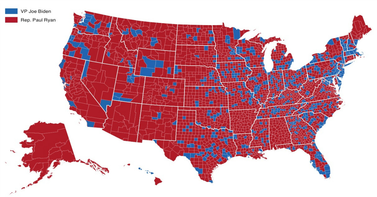
The Verizon and AT&T example is probably more applicable in explaining why so many of the poorest counties are in Republican states. The reason why is quite simply that most counties are Republican counties.
Look at any electoral map by county and every election looks like a Red tsunami hit the country – even in elections where Democratic presidents won. How could this be the case? Simply refer to the two examples above – there are more Republican counties, but the fewer Democratic ones have all the population.
It was brought to my attention by my friend Jason Hubbard who blogs at “We Are Capitalists,” that of the 100 poorest counties in question, 40 of them are from Texas, Georgia, and Kentucky. Not coincidentally, Texas, Georgia, and Kentucky rank first, second, and third in States with the greatest number of counties.
Of the nation’s 3,144 counties and county equivalents, nearly 17% of them are located in those three States. Blue States tend to be sliced into smaller numbers of counties than Red States, so they’re going to be overrepresented in any list of the top “x” poorest or richest counties. Massachusetts for example only has 14 counties, and New Jersey has 21.
According to my own calculations (the Excel document available here), Blue states made up 52.9% of all States, but had 39.1% of the counties, while Red States made up 47.1% of states, but 60.9% of the counties. The District of Colombia is counted as a “State” for the sake of the calculations, and States are designated as “Red” and “Blue” depending on how they voted in the 2012 Presidential election.
This isn’t to say that only 60.9% of counties lean Republican, just that 60.9% of all counties are located in Republican states. You can glean from the previously mentioned electoral maps that the number is likely much greater than 60.9%.
Worse, poverty is being measured in nominal terms, not adjusting for cost of living differences. In nominal terms, Texas has more poverty than a blue state like California, but after adjusting for differences in the cost of living, Texas actually has less poverty than California. Areas with higher population density have higher costs of living, areas with high population density tend to be the most liberal.
I previously debunked the claim that 9 of the 10 poorest States are Red States by adjusting for cost of living differences. When comparing cost of living differences among Red and Blue States, only one of the 24 Red States had a cost of living above the national average (Alaska), while 14 of the 26 Blue States, and the District of Columbia had costs of living above the national average.
On average among Red and Blue States, compared to the national average cost of living, the relative value of $100 in a Red state is $109, but only $98.08 in a Blue state. A dollar can purchase slightly over 11% more in a Red State than in a Blue State.
As for the claim that most poor counties are located in Red States – it’s a claim that’s “technically” true, but grossly misleading.
Even if politics has no effect on whether or not a state is rich or poor, we should expect a disproportionate number of poor counties to be Republican for the sole reason that most counties are Republican counties. Likewise, we also know that Red States are richer on average than they nominally appear, while Blue States are poorer than they’d like us to think.