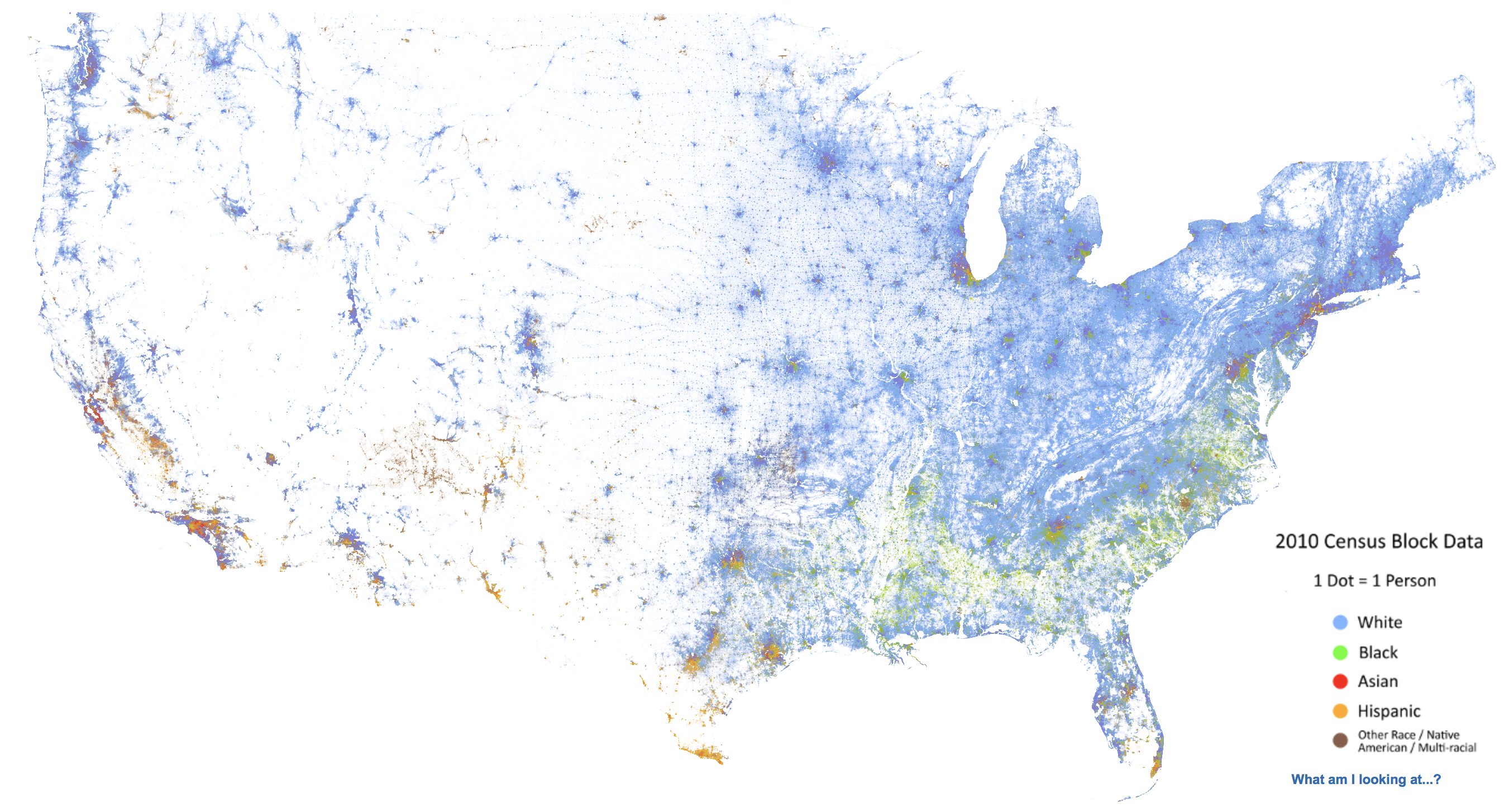
Since 2013, the Weldon Cooper Center for Public Service at the University of Virginia has provided “an accessible visualization of geographic distribution, population density, and racial diversity of the American people in every neighborhood in the entire country.”
Videos by Rare
According to the website,
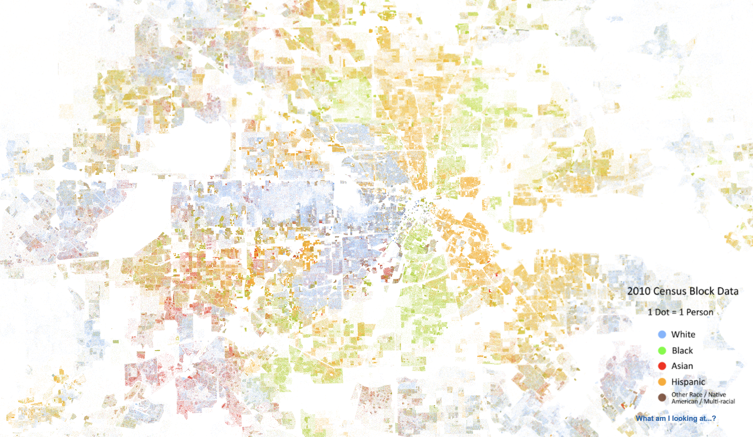
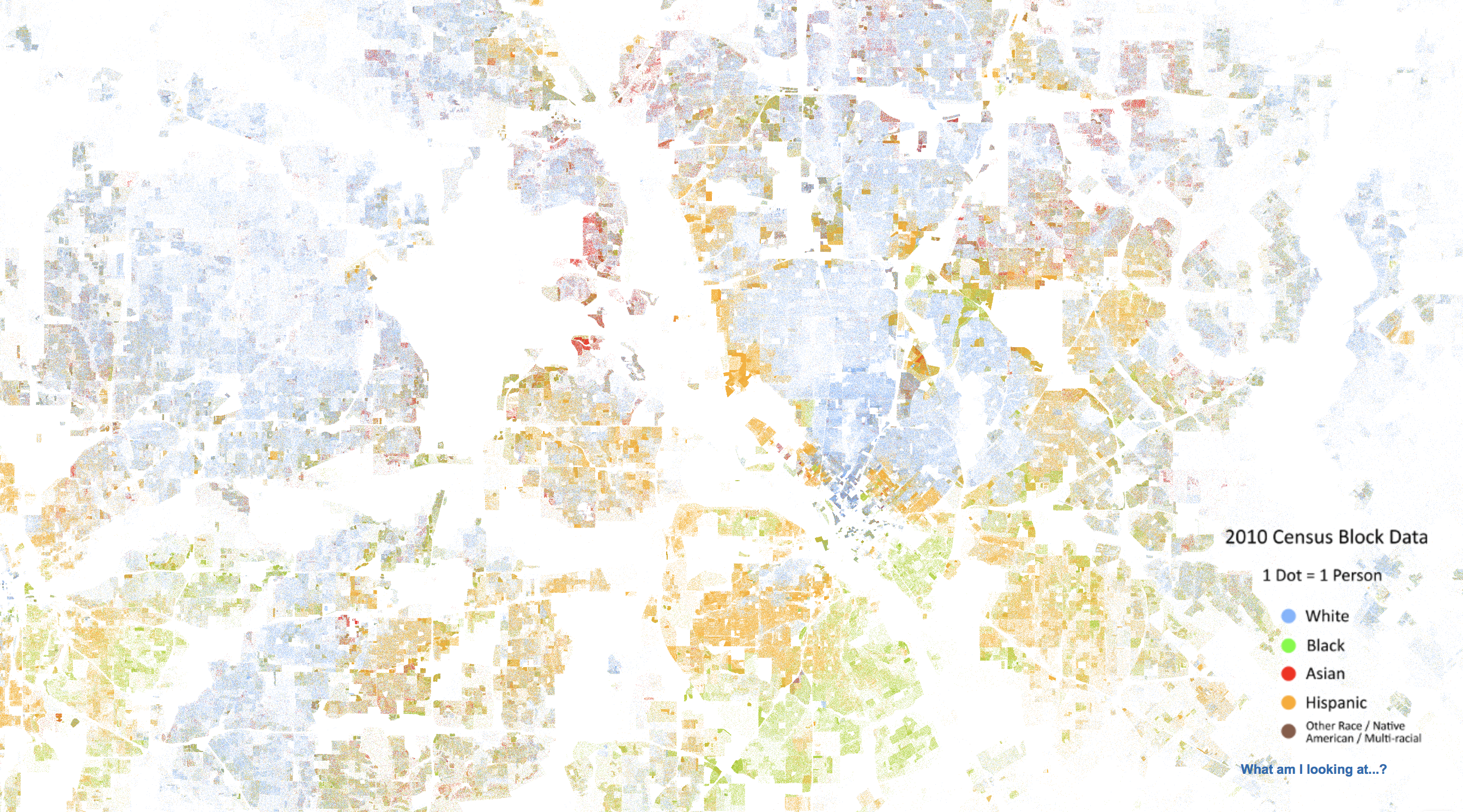
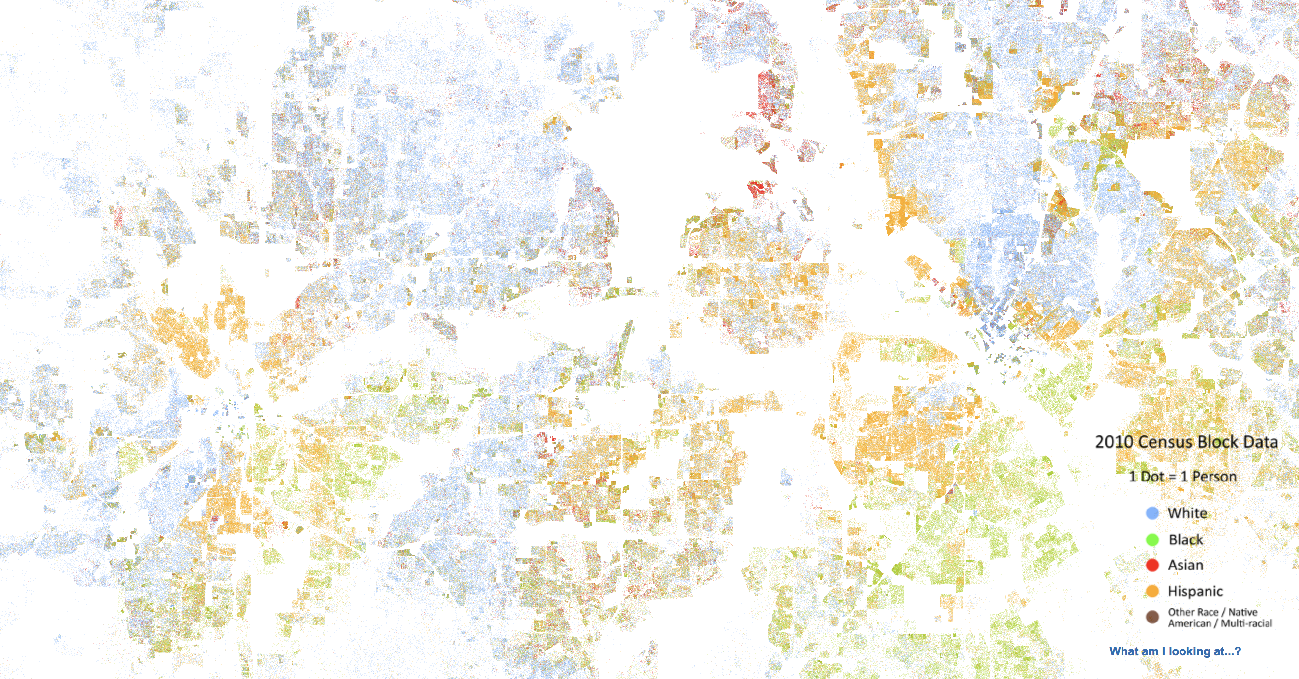
The map displays 308,745,538 dots, one for each person residing in the United States at the location they were counted during the 2010 Census. Each dot is color-coded by the individual’s race and ethnicity. The map is presented in both black and white and full color versions. In the color version, each dot is color-coded by race.
According to data compiled through information published by the National Historical Geographic Information System, the U.S.’ diversity, density, and distribution looks something like this:
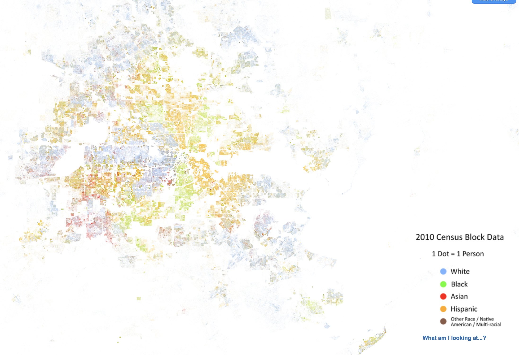
Even with a rapidly-growing diverse population, Houston’s colors don’t run:
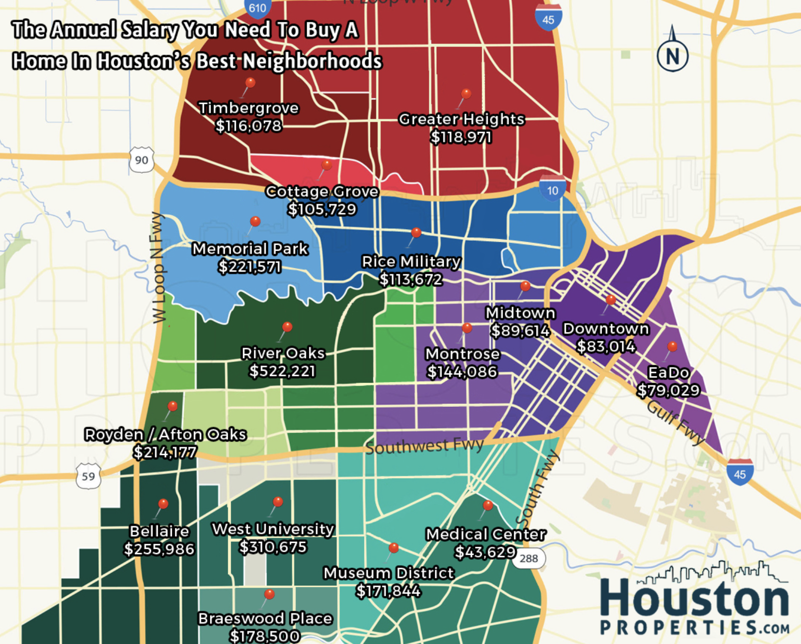
And they appear to largely correlate per race based on cost of living:
RELATED: A recent poll confirms Houston is best in the nation for the new American Dream
At least compared to Austin:
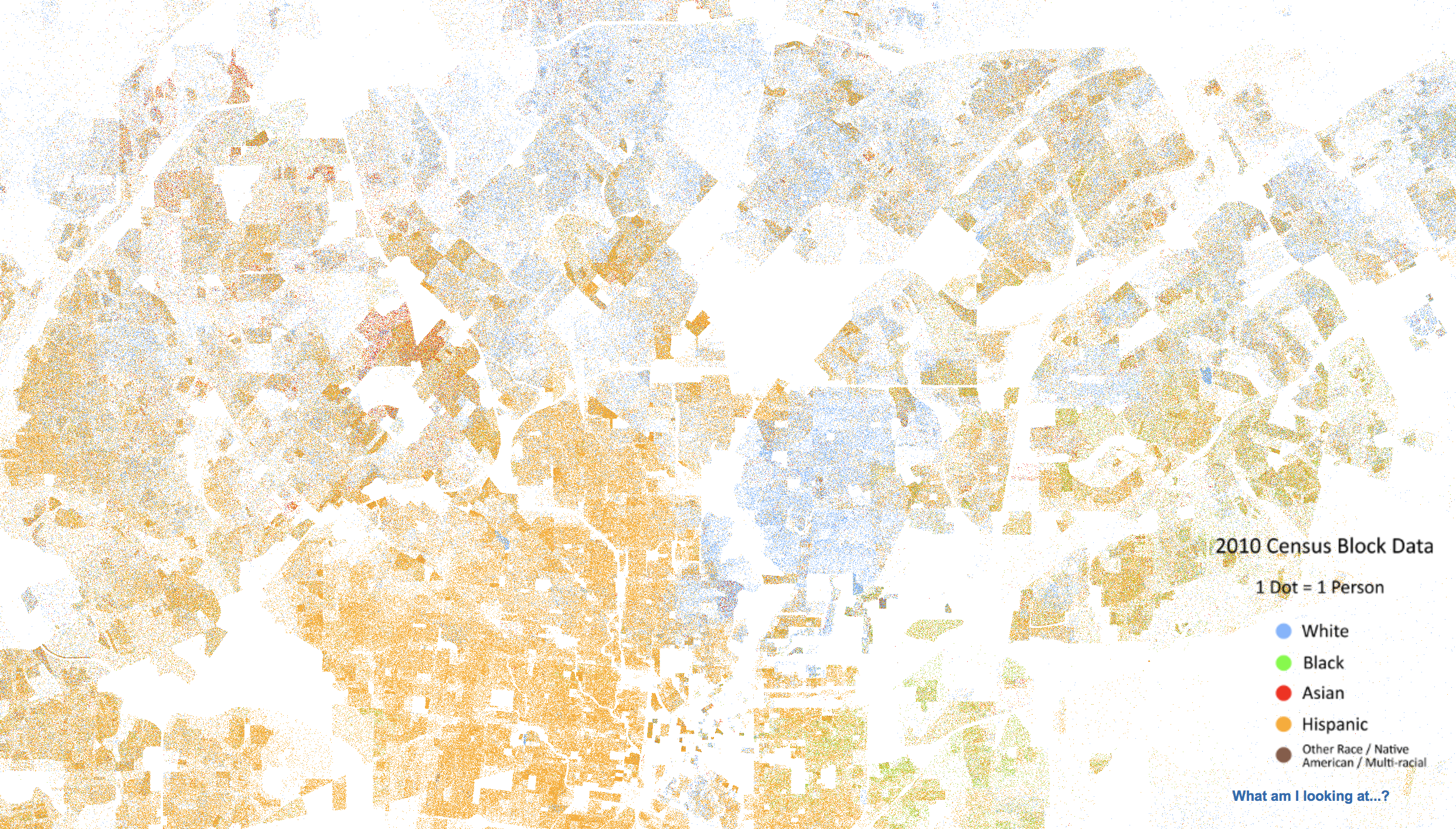
Comparatively, at a closer level, the data does not show as much intermingling of the races in Houston:
This also appears to be the case in Dallas, although, like Austin, Ft. Worth’s display appears more interspersed.
To read more about The Racial Dot Map project or to explore other cities, check out the full interactive map here.