Someone painstakingly mapped out where the most educated people live across the nation, and the finished product is spectacular

**COMMERCIAL IMAGE** In this photo taken by Feature Photo Service for IBM: Lauded by the U.S. Department of Education and President Obama, the IBM-inspired P-TECH school in Brooklyn, NY, where teens earn both a community college degree and high school diploma in as little as four years, graduated 27 students last evening at the commencement exercises held by the New York City College of Technology (City University of New York's "City Tech") at Barclays Center in Brooklyn, NY on June 2, 2016. Staring directly at the camera is Elisabel Herrera, one of the 2016 P-TECH graduates, who typically either continue on to four-year colleges or apply for jobs at technology companies like IBM. There are expected to be 60 IBM-inspired P-TECH schools in six states this fall. Nationally, less than 30% of students who enroll in two-year community colleges complete their associate's degree within three years, according to the U.S. Dept. of Education. (Jon Simon/Feature Photo Service for IBM)

Last month, an interactive map, based on information from the National Historic Geographic Information System, in affiliation with the TCU Center for Urban Studies, showing education levels across the U.S. was posted to GitHub, a public project hosting forum for open-source code.

Videos by Rare

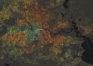
One dot equals approximately 25 people ages 25 and older, and the educational data is broken down by color:

Screen shot of education level map

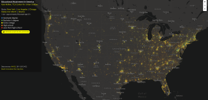
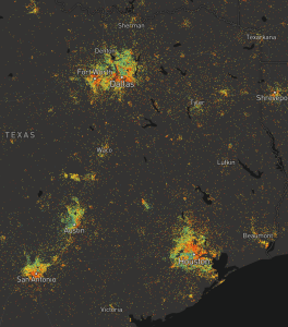
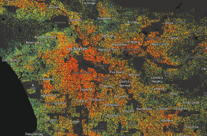
Texas and Houston are both colorful across the spectrum:

Screen shot of education level map

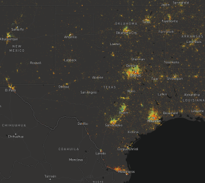
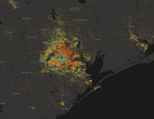
But there are some notable divides, naturally of corporate and chemical, in the Bayou City:

Screen shot of education level map

The concentration of highest education, a graduate degree blue dot, is on the West side of town, with a second cluster in Clear Lake, home to NASA’s Mission Control.

However, nearly all of the areas surrounding the large refineries and other industrial plants are colored orange and red, indicating residents have high school or less than an equivalent degree.

Screen shot of education level map

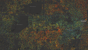
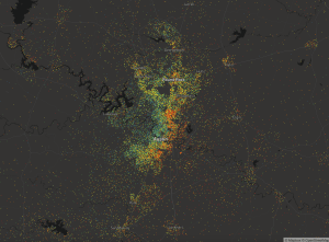
Austin has its own unique spectrum, with a natural concentration of high, graduate degree education on the West side surrounding the University of Texas’ main campus.

Screen shot of education level map

And the DFW area is somehow becoming larger than Houston.
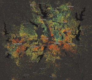
Screen shot of education level map

Maybe even smarter.

In Texas and across the nation, education levels are correlate with more expensive real estate and locations to live, with the exception of one place, where the predominant industry is getting paid to pretend:

Screen shot of education level map

The real education from this map is that it’s all about who you know.

Explore the rest of the nation’s education status’ and read about the Python program behind this colorful display here.

What do you think?

The man behind some of the most popular films of the 20th century has died

The 911 call for the accident involving former “Bachelor” Chris Soules paints a different picture of the night’s events