The coffee chain Starbucks derives its name from Moby Dick. In that classic tale, Starbuck is the first mate to Ahab on their quest to capture the elusive white whale. He is a young, strong, straight-laced sailor and, according to the Starbucks website, the company founders thought the term evoked “the romance of the high seas and the seafaring tradition of the early coffee traders.”
Videos by Rare
And that’s not the only romantic aspect of the brand’s marine marketing.
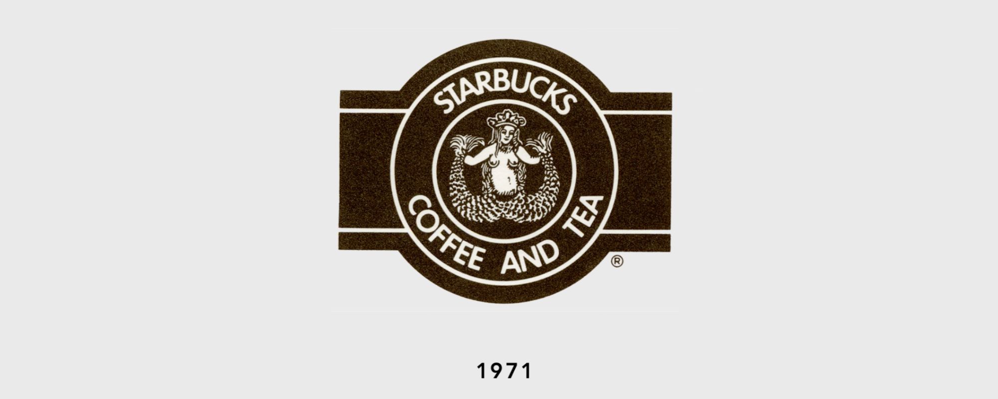
The Original Logo
Starbucks opened in America’s coffee capital, Seattle, Washington, in 1971. Founded by college buddies-turned-business partners Jerry Baldwin, Zev Siegl and Gordon Bowker, the young men based their business off the already-popular Peet’s Coffee, with a focus on quality beans. Surprising fact: Drinks could not be purchased in the store until 1976.
While planning out the business, Bowker, who at the time co-owned an ad agency, insisted that words with beginning with “st-” sounded more powerful. That led the trio to consider Starbo, a mining town in the Cascade range that they found on a map. From there, they recalled Starbuck, the name of Ahab’s first mate in Moby Dick… and the rest is beverage history.
With that name decided, naturally, an aquatic logo followed. The original Starbucks logo, pictured above, featured a twin-tailed mermaid illustration taken from J. E. Cirlot’s Dictionary of Symbols and was likely a woodcut image from the 15th century. In it, the mermaid — or, Melusine, as those two-tailed creatures were called in European folklore — dons a crown, clutching her fins to reveal stark naked breasts.
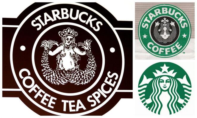
The Evolution of a Mermaid
It was certainly an attention-grabbing logo for the café shop, which moved from its original location to the famous site at Pike’s Place in 1976. However, as the coffee chain grew, the logo was edited for modesty. In 1987, long flowing hair was placed over the mermaid’s boobs. The rough-hewn texture of the original woodcut was also smoothed over for a more computerized, uniform look. That version, pictured above on the top right, was used until 1992. At that time, most of the mermaid’s (decidedly suggestive) double tail was cropped out. And in 2011, the new, greener iteration premiered. It’s recognizable today across 33,833 stores.
Despite the ongoing changes, though, the mermaid remains. And often, she is referred to as a siren. Like the sirens of Greek mythology who lured sailors to their rocky deaths with tempting songs, there she sits, perched on storefronts as a beckoning call for that oh-so-necessary elixir: coffee. The whirring of coffee grinders, a modern-day sea shanty.
Now, that’s good marketing.
In the video above, learn about how the company’s’ current mermaid earned her asymmetrical smile.