

English rock band Pink Floyd released the Dark Side of the Moon album in 1973. Their eight studio album sold 45 million copies and spent almost over 700 weeks topping the US music charts, and went 14x platinum in the United Kingdom. This Pink Floyd album artwork is seen everywhere: t-shirts, stickers, art prints, and street drawings. Even without the title, it’s recognized by nearly everyone as Pink Floyd’s Dark Side of the Moon.
Videos By Rare
Behind Pink Floyd
As a band, they were was fairly reclusive. The Pink Floyd band lineup consisted of Nick Mason on drums, guitarist Syd Barrett, Richard Wright on keys, guitarist David Gilmour, Bob Klose, and Roger Waters on bass. Together, they were known to their increasingly growing fan base in the early 70s for their visual light shows, lyrically heavy topics written by bassist Roger Waters, and concept art. If you need a refresher, take a look at the covers for “Atom Heart Mother,” “UmmaGumma,” or “A Saucer Full of Secrets”- pretty trippy. Combining those elements and a bit of mystery, the band partnered with Storm Thorgerson and Aubrey Powell of Hipgnosis for creative direction to represent their new album. Hipgnosis was a design agency known for creating album art for some of the most well-known rock albums from Black Sabbath, Led Zeppelin, AC/DC, and many more rock and classic rock heavy hitters.
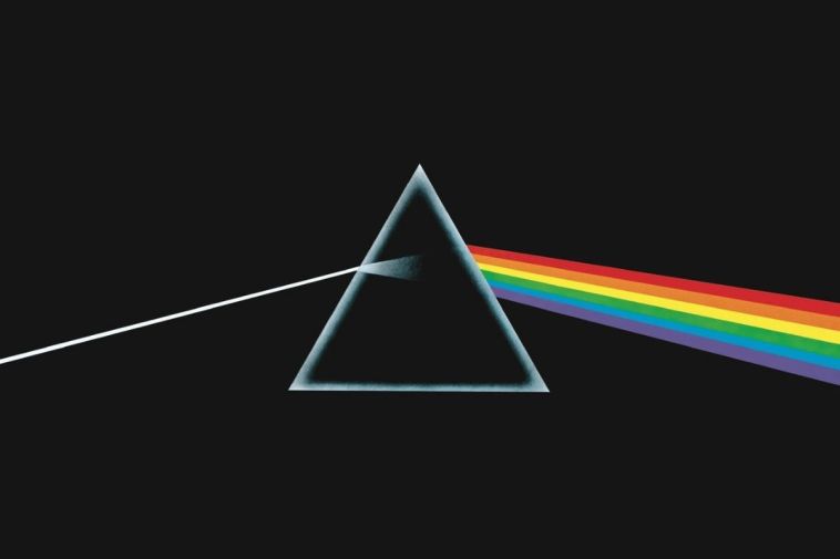
The album art featuring the light prism and a complete lack of the band’s branding on the album cover and vinyl foldout has become synonymous with the Pink Floyd Logo. The band pretty much gave free creative reign to Hipgnosis for the cover design. Keyboardist Richard Wright is quoted, having suggested something “clean, elegant and graphic.”
https://www.youtube.com/watch?v=n-vI53Tv2GM
Storm Thorgerson
Storm Thorgerson, who designed the album art and the Wish you were here album art, described it in 2017 as, “The idea itself was cunningly cobbled from a standard physics textbook, which illustrated light passing through a prism. Of significance was the simple, elegant layout against black – standard textbook illustrations did not do this. Also important to the art direction was the fortuitous decision to listen to Rick Wright, who suggested we do something clean, elegant, and graphic, not photographic – not a figurative picture. And then to connect this idea to their live show, which was famous for its lighting, and subsequently to connect this to ambition and madness, themes Roger was exploring in the lyrics… hence the prism, the triangle, and the pyramids.”
There is also the metaphorical (but music fans swear is a literal) representation of a heartbeat in the rainbow on the inside of the albums, perhaps suggesting a link between music and life. Other album art included infrared photos of Giza pyramids. The band went out of their way to not actually promote the album with their name is nowhere on their record. This was somewhat a new thing to do in rock music. Thus, it became known as its symbol.
The existence and image of the Pink Floyd logo did seem to change when they released new albums. Following the “Dark Side of the Moon” release, Pink Floyd The Wall period often featured an inky stylized title. From 1985, when they released “The Division Bell,” the logo changed slightly again to a rounded imaginative P and F symbol, representative of a man rowing a canoe.