The Michigan’s Kalamazoo Growlers made news this week when they announced they will be creating mosaic-style jerseys made up of fan selfies.
Videos by Rare
In honor of this awful jersey decision, and in the spirit of National Awkward Moment Day, here are some of the more atrocious jerseys of all time.
10) Tampa Bay Devil Rays
http://por-img.cimcontent.net/api/assets/bin-201109/96616d86abcd41bd91e436b3acb8a644.jpg
Can one concoct a more bland or boring concept than this — thankfully — defunct Devil Rays jersey?
Expansion teams are certain to experience rough beginnings on the professional stage, but the least the Devil Rays could have done was make like Buzz Lightyear and fall with style.
9) The New York Knicks 2013 Christmas Day Jersey

It’s stunning to think that something like this exists. Not that the OKC Thunder’s Christmas Day jerseys are brilliant by comparsion, but this Knicks jersey simply should never have been.
Oh, what I’d give to be a fly on the wall during the presentation that birthed this problem.
8) The Colorado Rockies 90’s

The 90’s rarely produced anything worth bringing into the 21st century clothing-wise and this Rockies jersey thankfully suffered the same fate. You know you have a bad jersey when the first thing that escapes one’s mouth is: “Is this a joke?”
7) Montreal Expos 80’s
http://2.bp.blogspot.com/-7k93vTja1ww/Ub4Lfyzo4qI/AAAAAAAAGHM/0OjIrwcwJj4/s1600/dawson+expos.jpg
If anyone could pull off this powder blue mess, I guess it would be hall-of-famer Andre Dawson, but despite his best efforts this retro Expos classic leaves a lot to be desired.
What more can you expect from a team named after a world fair that happened in 1967?
6) Denver Nuggets

This early 80’s technicolor Nuggets jersey, although widely viewed as a classic — a fact supported by it’s continued use — is one of this writer’s least favorite. Let’s just say the Nuggets didn’t strike gold on this one.
5) Washington Bullets

From the short shorts — clearly worn the best by Manute Bol above — to a patriotically colored jersey that has the opposite effect the team’s originators intended (“[The name] is hoped to be significant of [the Bullets’] explosive talents and speed in humbling the opposition”) this retro fail is still sported today by the Wizards for reasons unknown.
4) Vancouver Canucks 80’s

This jersey brought a whole new meaning to v-neck. I get the ‘v’ for Vancouver reference, but the coloring makes no sense.
3) The Tampa Bay Bucs

The only redeeming quality of this uniform is the retro Buccaneer logo, but that is easily overridden by its puke-colored, baby-food-hued companions.
2) The Pittsburgh Pirates early 2000’s

This cringing, possibly constipated pirate says it all.
Why are pirate-themed uniforms so shoddily designed?
1) Cleveland Browns

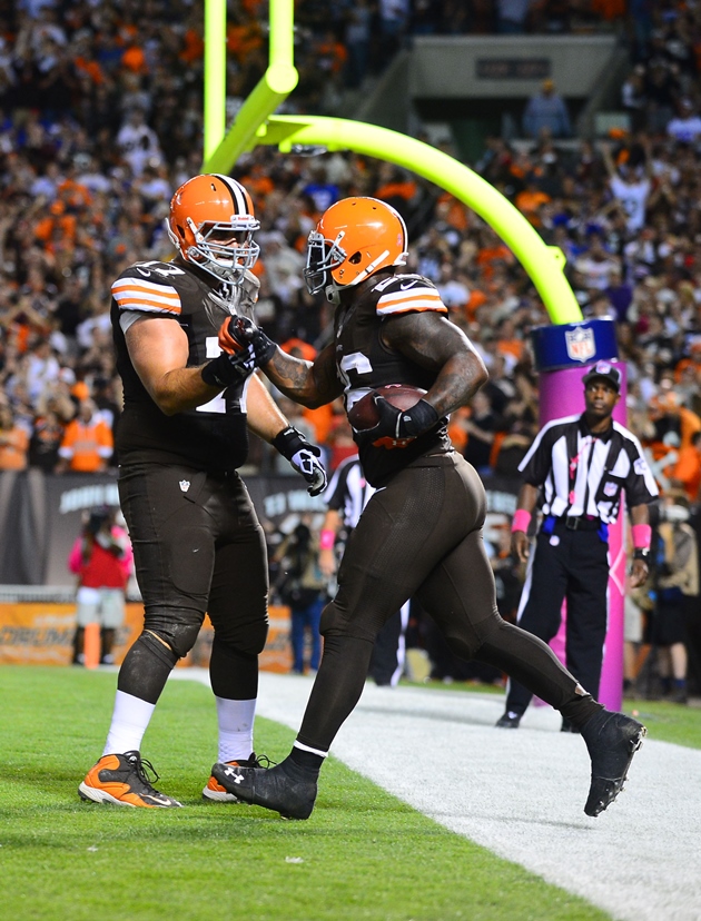
The Cleveland football team has a theme: Brown.
Now, when you play as — how do I put this? — poorly as the Browns do on a yearly basis the last thing you probably want outsiders to think of is the color brown. These uninspired, yet somehow a propos, jerseys of the Browns take the cake on this list.
(H/T New York Daily News and Bleacher Report for some inspiration)


