Is the rent too damn high after all?
Videos by Rare
The National Low Income Housing Coalition’s annual report on housing affordability certainly makes it seem so.
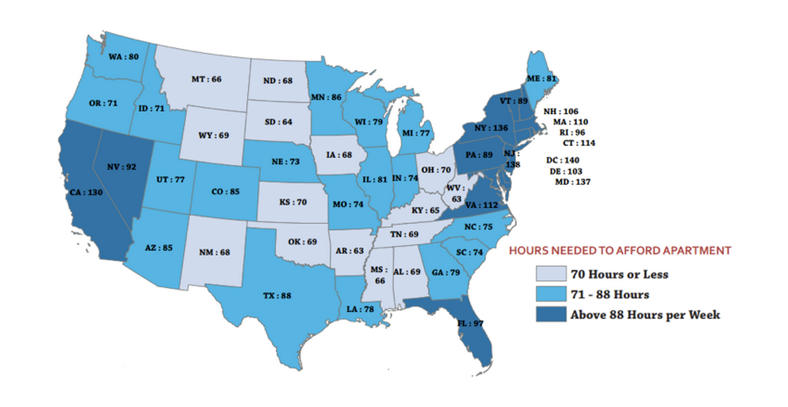
For instance, look at the NLIHC’s data for any recent year and you’ll “learn” that there are no states where you can afford to pay gross rent (rent + utilities) on minimum wage without working over sixty hours a week.
Here’s a 2012 version of the chart posted on clickbait “news” site Upworthy:
But then again, maybe not.
Note that only two bedroom apartments are being measured – so we’re measuring what one earner would have to generate to pay for an apartment meant to house two people. The amount of hours needed to work to pay for the month’s rent should be cut about in half.
Yet after diving deeper into the data the chart is even more misleading than it seems.
Let’s isolate a state that I have some direct knowledge of and look at the data.
New Jersey’s minimum wage is $8.25, but was $7.25 when this chart was released. If we really needed to work 138 hours at minimum wage to make rent, it would imply a weekly cost of $1,000.50 for rent, or $4,002 a month.
To put in perspective how absurd that is, a two-bedroom apartment in London will set you back roughly £1,605 pounds a month, or $2,577 a month in American dollars.
Rents are so expensive in London that it’s actually cheaper to live in Barcelona and commute to work in the UK by plane on a daily basis than live in a London apartment.
I’m extremely skeptical that New Jersey is in the same situation. This is so, in part, because I pay a gross rent of $600 a month here. This requires 18 hours of work at our state’s minimum wage.
Now, the NLIHC was basing its statistic on the average cost of a two-bedroom apartment in NJ being $1,302 – but this would “only” require about 45 hours of labor a week to pay for (without a roommate buffering the cost). Forty-five hours is a lot, but it’s nothing like the 138 hours the chart claims is needed.
So how did they arrive at these conclusions? It’s conventional wisdom in personal finance that housing costs shouldn’t exceed 30% of your income. What this chart is actually measuring isn’t how many hours you would have to work at minimum wage to afford a two bedroom apartment, it’s measuring how many hours an individual would have to work for an apartment meant to house two people – and have it only consume 30% of their income.
The chart thus doesn’t measure how many hours of work it takes to pay for rent, it measures the amount of hours it takes to earn rent – times three!
This is a terribly important detail that very few reporting on the NLIHC’s data saw fit to include, even though it was clearly in the fine print of the original chart released. Chalk up another one for damned lies and statistics.