Videos by Rare
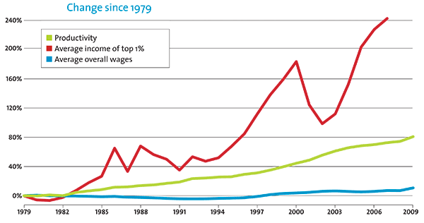
In 2011 on his MSNBC show, Ed Schultz begged for any Republican to come on his show and explain how the chart pictured above from Mother Jones is “good for America.” He offered to pay for their plane ticket and hotel, plus he threw in an offer for dinner with himself.
I don’t know how sold I am on meeting Ed Schultz, but I’ll take a free meal when I can get one.
I’m not going to argue about whether the Mother Jones chart is good for America – or bad for America for that matter. Making an argument either way would only lend credibility to a graph which was constructed for the purpose of being misleading.
It’s easy to “prove” that the average person’s wages have stagnated when you’re charting them next to the highest earners in our society. I could “prove” that the typical one percenter hasn’t done all that well by charting their income gains each year (in dollars) against those of Warren Buffet or Bill Gates.
The striking part of the chart however, is that productivity has risen while wages have remained flat. Even if wages don’t increase for the typical person at the same rate as the top 1%, we should expect them to at least keep up with productivity. Ed, and many liberals are inferring from this that the gap between productivity and wages are because the top 1% (or higher earners) are “taking” the difference. Or at least this was Elizabeth Warren’s argument when she claimed that the minimum wage should be $22 an hour if correctly indexed to productivity (as opposed to $7.25), asking “what happened to the other $13.75?” The study Warren cited actually gave a wide range of figures for what the productivity adjusted minimum wage should be – which spanned from $9.22 to $22. Naturally, she chose the largest figure (and no, Warren isn’t taking into account that productivity for low-skilled jobs has risen slower than productivity across all sectors).
But herein lies a problem – productivity and total compensation haven’t decoupled to the extent that the Mother Jones chart shows. The average earner isn’t paid just wages – they’re paid wages and benefits. Indeed, while wages and productivity have decoupled, productivity has not decoupled with both wages and benefits.
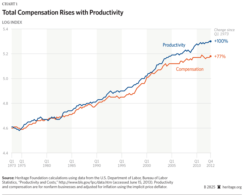
A separate study published by the London School of Economics found that the gap between productivity and total compensation since 1972 is a small as 13% in the US, and that there’s been no decoupling in the United Kingdom (which has a similar level of inequality as the US).
Based on the chart above from Heritage, we can see that on the Mother Jones chart, the blue line should instead be charted right underneath the green productivity line, which would debunk the notion that the average person’s income has been flat for the past three or four decades.
Conservatives have long claimed that inequality is irrelevant, so long as there is income mobility. Open any Thomas Sowell book and you’ll find that statistic that about half of individuals who began in the bottom 20% of the income distribution in 1996 moved up to a higher quintile by 2005. Meanwhile, 75% of those in the top 0.01% dropped down to a lower quintile during that period. Liberal critics would make two objections to this; that income mobility is lower in the US than European nations, and that income mobility is inversely correlated with inequality.
In respect to the claim that the US has less mobility than European nations, it turns out that this isn’t an apples to apples comparison. The US has a higher income threshold to be defined as “middle class,” and thus a poor person will have to make more income to go from being statistically defined as “poor” to “middle class” as they would in another nation. For example, income mobility from the lowest fifth to middle class is higher in Sweden than in the US – but it only takes $12,500 in additional income to accomplish this in Sweden, compared to $22,000 in the US.
The case that heightened inequality will reduce mobility was put forth in a speech by Alan Krueger, the Chairman of the Council of Economic Advisors. In what he dubbed the “Great Gatsby Curve,” Krueger charts the levels of income inequality among nations against intergenerational mobility among nations, demonstrating an inverse correlation. (Note that he’s measuring intergenerational mobility, not the mobility of individuals like I was). So certainly if we isolate the United States into different commuting zones, we should expect the same correlation: zones with more inequality having less mobility. However, this is not the case. Regardless of whether or not we measure inequality as it’s traditionally measured (the gap between the bottom and top quintiles) or between the 1% and the 99%, the effect on mobility is non-existent.
As an entrepreneur himself, Ed should know that the economy isn’t like a pie, where a rich person’s large slice means a smaller slice for everyone else. In a capitalist economy where one gets rich by providing goods and services demanded by others, a few more pies get baked in the process.
Now, know any good restaurants in NYC?